


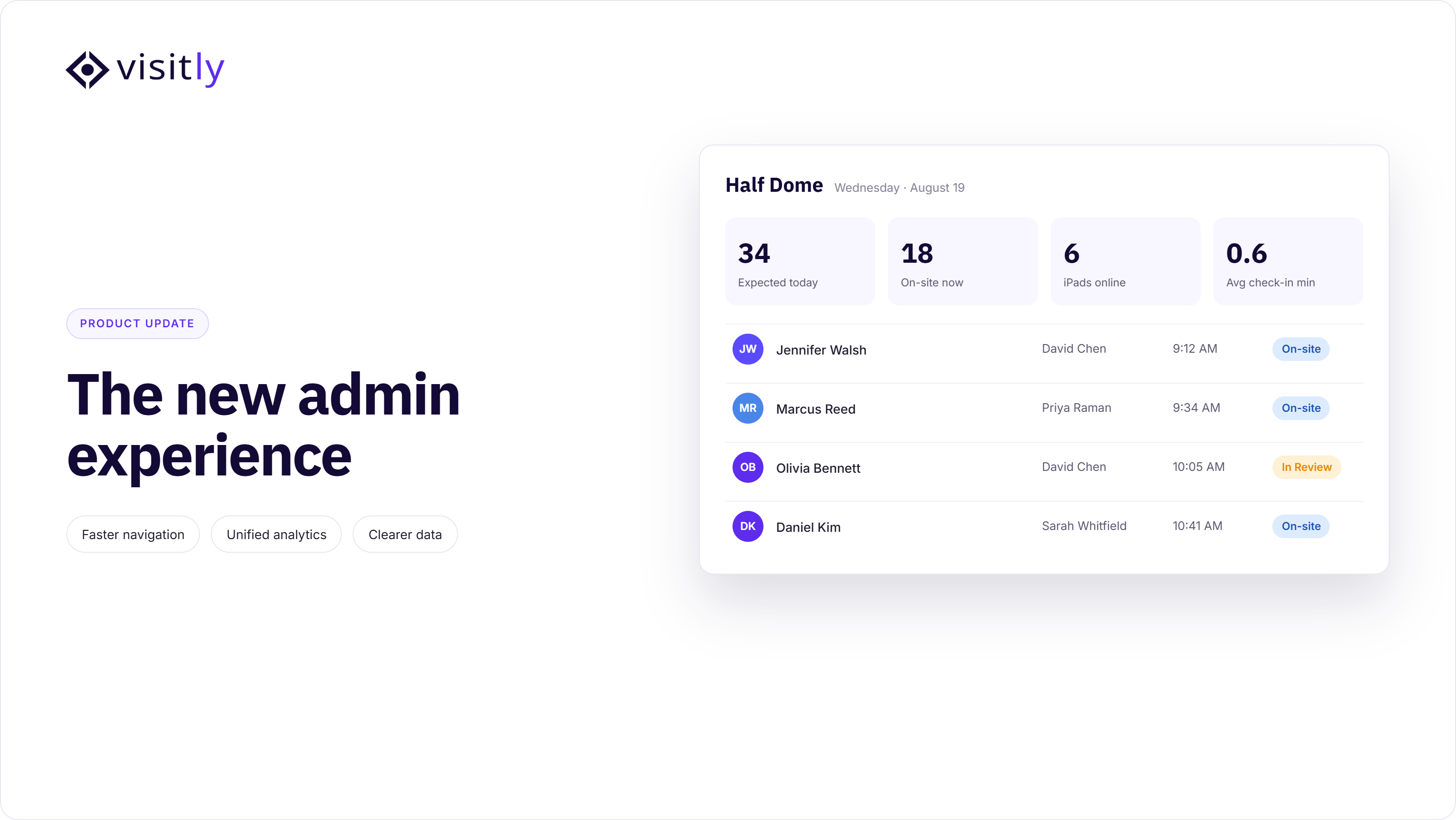
Your day usually starts with the same handful of questions: Who's expected? What's still sitting in the mailroom? Is every site running the way it should? Answering those used to mean opening several different tabs and piecing it together yourself. The New Admin Experience is built around a simpler idea — you shouldn't have to go looking for the start of your day. It should already be waiting for you when you log in.
The Visitor Dashboard, Delivery Dashboard, Multi-Location Dashboard, Visitor Log, Pre-Registration, Emergency Management, and Analytics are live in a cleaner, faster, more modern layout — alongside a redesigned navigation panel that gets you to Locations, Users, Integration Hub, and Settings in fewer clicks. Today's interface — what you're using right now — is what we're calling Classic from here on.
At a glance
- Redesigned Visitor, Delivery, Multi-Location, and Analytics dashboards, plus Visitor Log, Pre-Registration, and Emergency Management
- A streamlined navigation panel and noticeably faster performance throughout
- Same data, permissions, integrations, and workflows — this is a visual and navigational redesign, not a functional change
- Switch between Classic and New anytime, at your own pace, location by location if you want
- Classic retires on September 2, 2026 — after that, the New Admin Experience is the only option
What hasn't changed: Your data, permissions, integrations, and workflows are identical. This is a redesign of how you see and navigate them — not a change to what the platform does. A few specifics worth calling out directly:
- The iPad/kiosk check-in app is unchanged. This redesign is admin-side only — what your visitors see and use at the front desk isn't affected.
- SSO, user roles and permissions, and the API are untouched. If you've integrated Visitly with an identity provider or built on top of our API, nothing here requires changes on your end.
Daily dashboards
A sharper Visitor Dashboard
The Visitor Dashboard is the one screen most admins and front-desk teams live in all day, so it had to do more than just display numbers — it needed to let you run the front desk from one place. In Classic, that meant a wall of tiles and charts competing for attention, with the actual actions you needed scattered elsewhere. The redesign puts the whole workflow in one view: Invite Visitor and Create Visit sit right where you're already looking, so getting someone onto tomorrow's schedule doesn't mean hunting for a different tab.
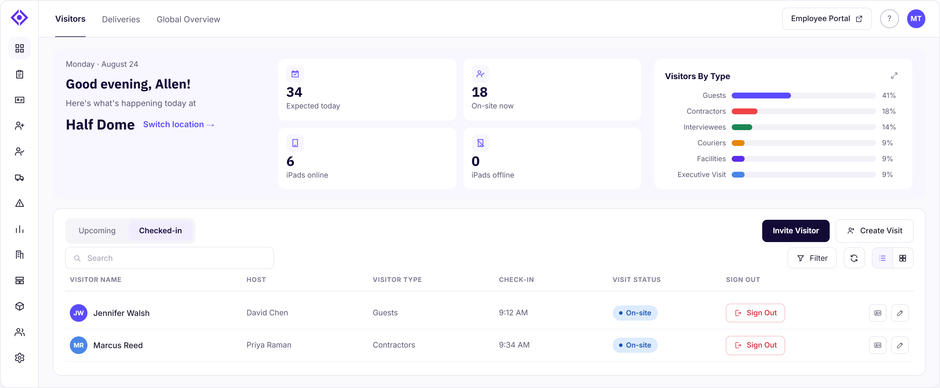
The Upcoming and Checked In tabs are where the day actually happens. Upcoming isn't just a list to glance at — you can check a visitor in directly from it the moment they arrive, without navigating away. It's also where you catch problems before they become someone standing at a locked door: visitors by type, the peak arrival window, and pre-registration status tell you whether the day's arrivals are on track or if something's about to bottleneck. Select into any visitor for a detailed view, and you've got the actions you'd actually need in the moment — add someone to the watchlist, print their badge, or cancel a visit — right there, instead of buried three clicks deep. Every one of these actions already existed — what's changed is how quickly you can get to them.
A dedicated Delivery Dashboard
Mailroom operations tend to be an afterthought in most visitor management platforms — a log, not a workflow. This redesign treats deliveries as something you act on, not just review: mark a package Picked Up, Discard one that's no longer needed, or open a Detailed View for the full history on a specific delivery — all without leaving the dashboard.
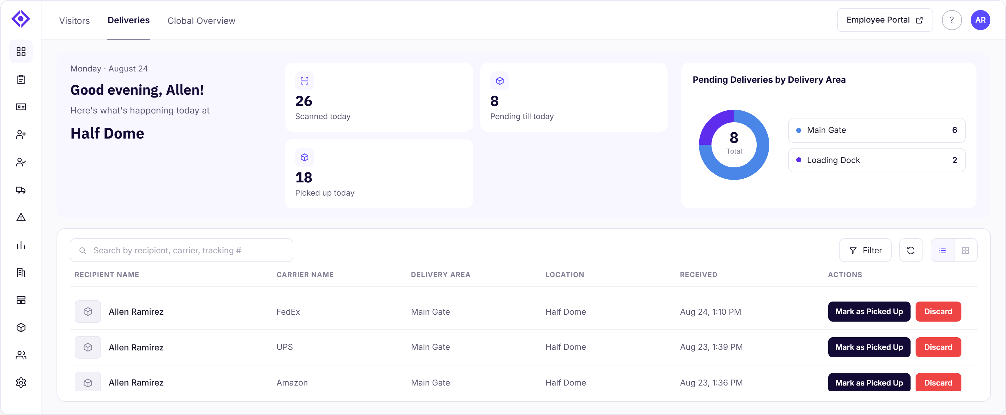
Paired with a clear breakdown of where deliveries are piling up by area, that's the difference between a mailroom that reacts to problems and one that gets ahead of them. The workflow itself isn't new — it's the same delivery process, just easier to run and quicker to load.
A true Multi-Location Dashboard
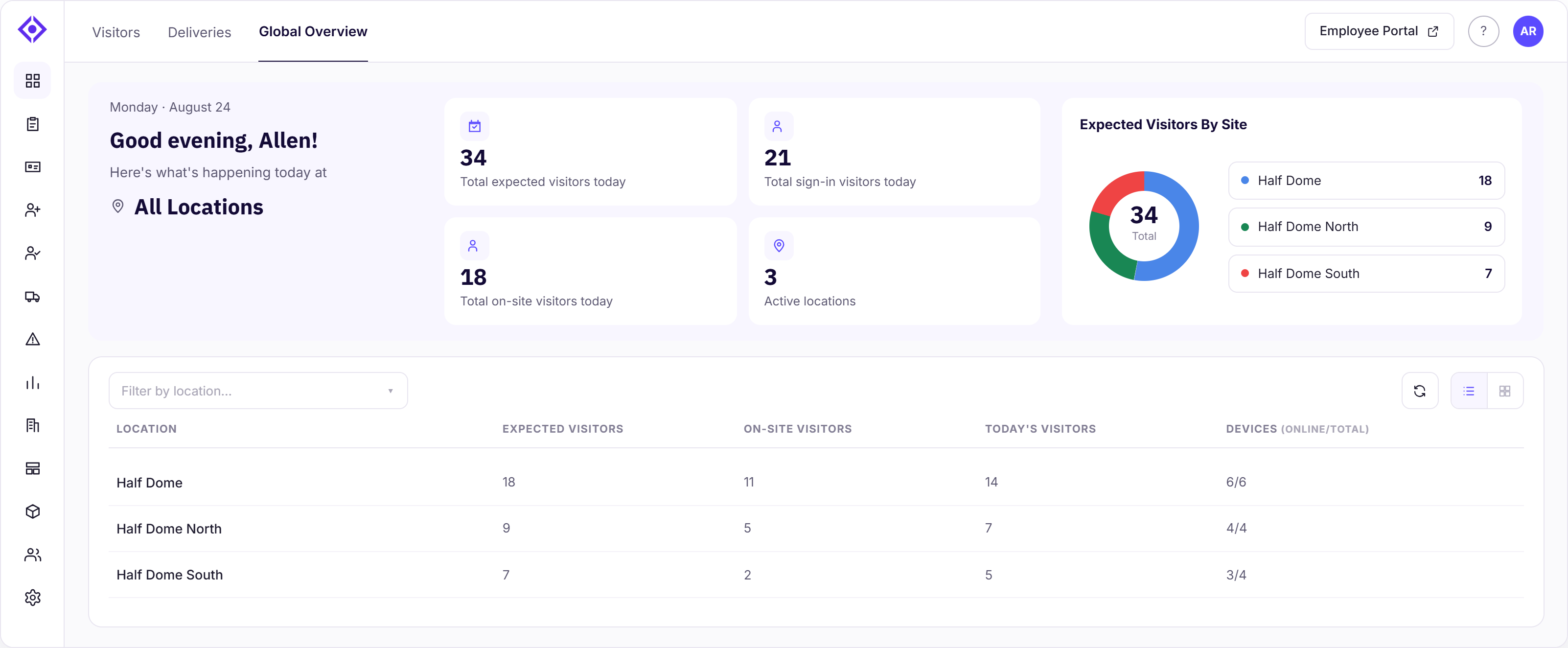
For anyone responsible for more than one site, the Multi-Location Dashboard removes the tax of clicking into each location just to check on it. One all-locations view rolls up expected visitors and checked-in visitors across every site in your account, so you can spot the one location running hot — or one where something's off — without a single extra click. For a facilities director managing a large footprint, that's the difference between a daily fire drill and a five-minute morning check. The data was always there — it's just quicker and easier to see now.
Visitor records
A tidier, more organized Visitor Log
The Visitor Log is where you go when you need to answer a specific question — did this person sign in today, who's still on-site, what happened last Tuesday — and it's the same capability, just easier to actually use. A single search box covers name, email, phone, host, or company, so you don't need to know which field to search in before you start. All Visitors, On-site, and Signed Out tabs narrow the list instantly, and quick date filters — Today, Yesterday, Last 7D, Last 30D, All, or Custom — let you check a specific window without typing exact dates. Turn on Auto Refresh at the front desk and the log stays current on its own, no manual refreshing required.
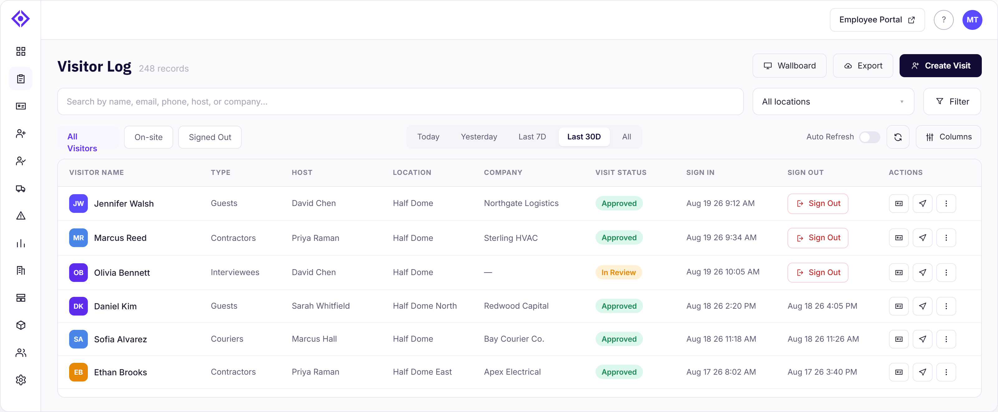
Columns give you a view built around what you actually care about — the same idea as Pre-Registration's column settings, applied here too — so a front desk admin can prioritize host and company while a security team pulls in visit status and sign-out times. The everyday actions are just as easy to reach: sign someone out, print a badge, Invite Again to send a repeat visitor a new invite without re-entering their details, add to the watchlist, leave an internal Note on a visit for the next shift to see, or export the whole filtered view for a report — all right from the log itself, plus a Wallboard view for a location that wants the log visible on a screen at the front desk. Nothing here is a new capability — it's the same Visitor Log, just more organized and quicker to move through.
A smoother Pre-Registration experience
Pre-Registration got the same treatment as the Visitor Log — same capability, easier to move through. All, Pending, Completed, and Walk-In tabs, plus quick date filters (Today, Tomorrow, Next 7D, Next 30D, Future, Custom), make it faster to see what's actually coming up instead of scrolling a flat list. Columns works the same way it does in the Visitor Log — a view built around what you actually care about, so a front desk admin can prioritize company and scheduled check-in while a security team pulls in host and visitor type.
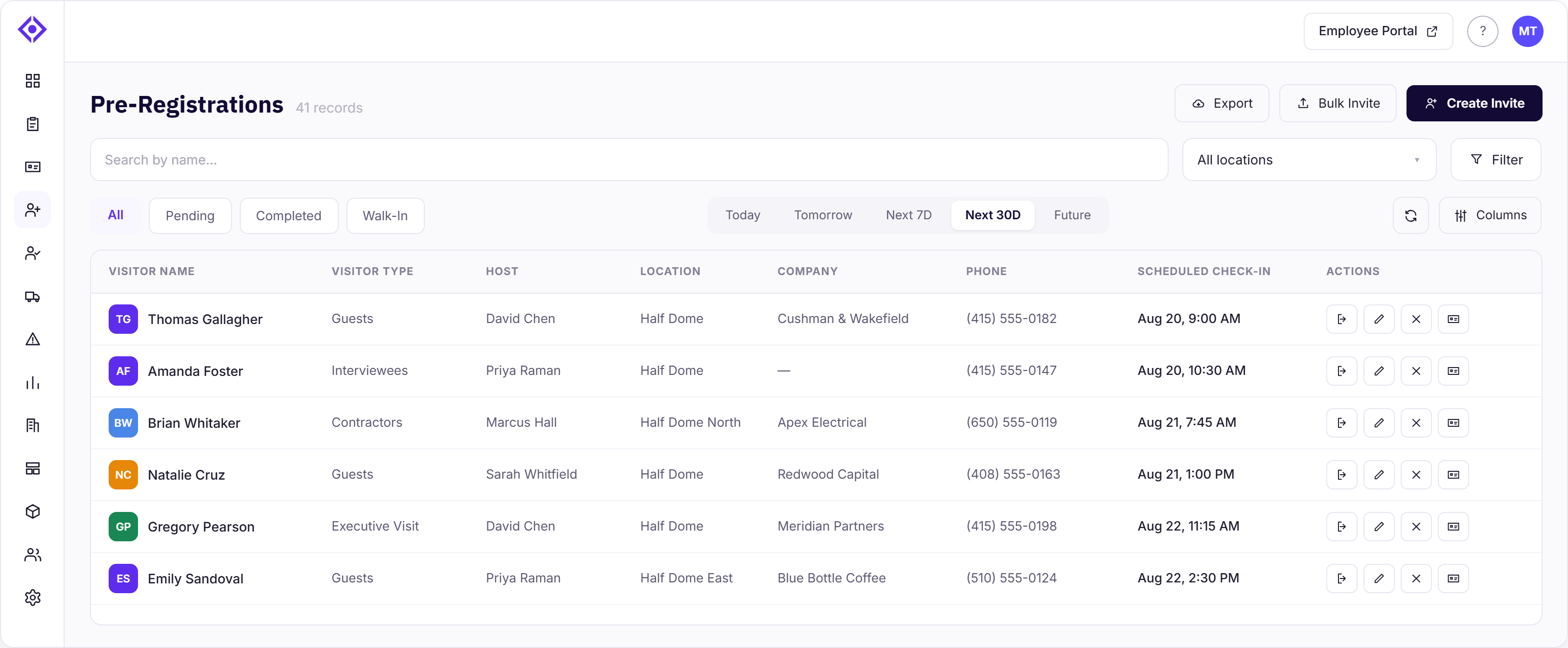
Open a single pre-registration and the detail view stays just as tidy: Edit, Invite Again, Cancel Visit, Print Badge, and Check In sit together at the top, with Send Notifications right where you're looking at the visit's date and time — so you can move someone from pending to checked-in without hunting for the right button. Everything else about that visit — host info, signed documents, videos watched, ID verification, internal notes, and the notification log — sits below in its own labeled section, so a fuller record is there when you need it without cluttering the view when you don't.
Creating a new invite or visit is quicker too, with a live summary panel that updates as you fill in the form, so you can see exactly what you're about to save before you save it. And if you're registering more than one person — a group, a team, back-to-back contractor visits — Save & Add Another (or Check In & Add Another when checking someone in directly) keeps the form open and ready for the next entry, instead of sending you back to the start every time. Nothing here is a new capability — it's the same Pre-Registration workflow, just more organized from top to bottom.
Safety
A clearer Emergency Management view
Nothing in this redesign matters more than what happens during an actual emergency, because that's when interface friction has the highest cost. In Classic, the Live Roster showed one location at a time, with visitor and employee counts split across tabs and separate donut charts — useful information, but you had to assemble it yourself while a clock was running.
The redesign lays out every location as its own card on the main page, so an evacuation manager overseeing multiple sites can see all of them at once instead of switching between them. Each card shows the total visitor and employee count for that location alongside how many are still on-site right now — so the gap between those two numbers is exactly who hasn't been accounted for yet, the single most important read in a live evacuation, visible without doing any math yourself. And you can act right from that same card: Start Evacuation, Send Alert, or View Live Roster, with no detour required.
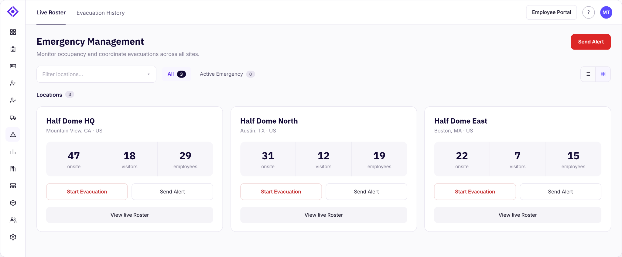
Two details are easy to overlook but genuinely useful once you need them. From a location's detailed view, you can Print Report for a physical record — and that report is dynamic, updating automatically as the evacuation starts and ends, so what you print reflects what actually happened rather than a stale snapshot from when you first opened it. And when you send an alert, you're not writing it from scratch under pressure: templates for Fire Alarm, Active Threat, Drill, and Weather give you a starting point that's already appropriate to the situation, so the message goes out faster and says what it needs to.
To be clear, none of this changes what evacuations do — this is a visual and workflow redesign, not a change to the underlying capability — but a faster, more legible interface is itself a safety improvement when minutes count.
Insights
A more insightful Analytics view
Analytics only earns its place if it changes what you do next, and the old layout made that harder than it needed to be: a long, uniform scroll of charts with no grouping to suggest which ones belonged together. The redesign organizes everything around the questions you're actually trying to answer, with location and date-range filters that apply across the whole view instead of per chart:
- Location Overview — visitors by location and by type, for a quick read on where and who.
- Visitor Traffic — checked-in visitors and total visits by location over time, so you're looking at a trend, not a snapshot.
- Visitor Composition — visitor type breakdown and pre-registered vs. walk-in, so you know who's actually coming through the door.
- Compliance & Documents — document status and within- vs. off-business-hours check-ins, built for the exact moment a compliance officer or security lead needs to reconstruct that story for an audit or after an incident.
- Behavioral Insights — top 10 hosts by week and visitor traffic by hour and day of week, so staffing decisions are based on actual patterns instead of a guess.
- Monthly Trend — visits per month by location, for the longer view when a single week isn't enough context.
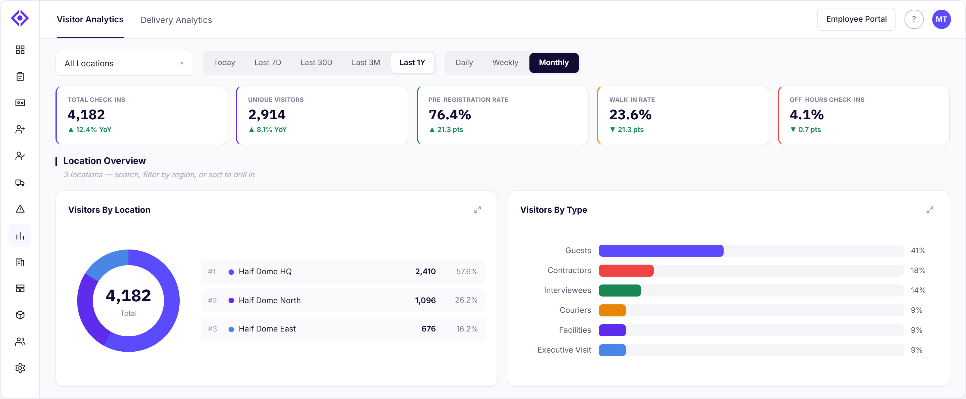
Every report can be opened in a detailed, zoomed-in view when you need to look closer, without losing your place in the rest of the dashboard.
Delivery Analytics gets its own tab in the same view, organized the same way — grouped around what a Deliveries Admin actually needs to know rather than a flat wall of numbers. Delivery Flow shows deliveries scanned in and the average days to pick up, so you can tell whether packages are moving at a normal pace or starting to sit longer than they should. Pickup Performance tracks deliveries picked up against what's still pending, so a growing pending count doesn't go unnoticed until someone asks where their package went. Triage & Routing compares deliveries received versus picked up over time and breaks activity down by delivery area, which is exactly what tells you whether a specific gate or dock is the source of a backlog rather than the mailroom overall. And Recipients & Pending surfaces your top recipients and current pending pickups directly, so following up on the packages actually sitting there doesn't mean digging through the delivery log by hand.
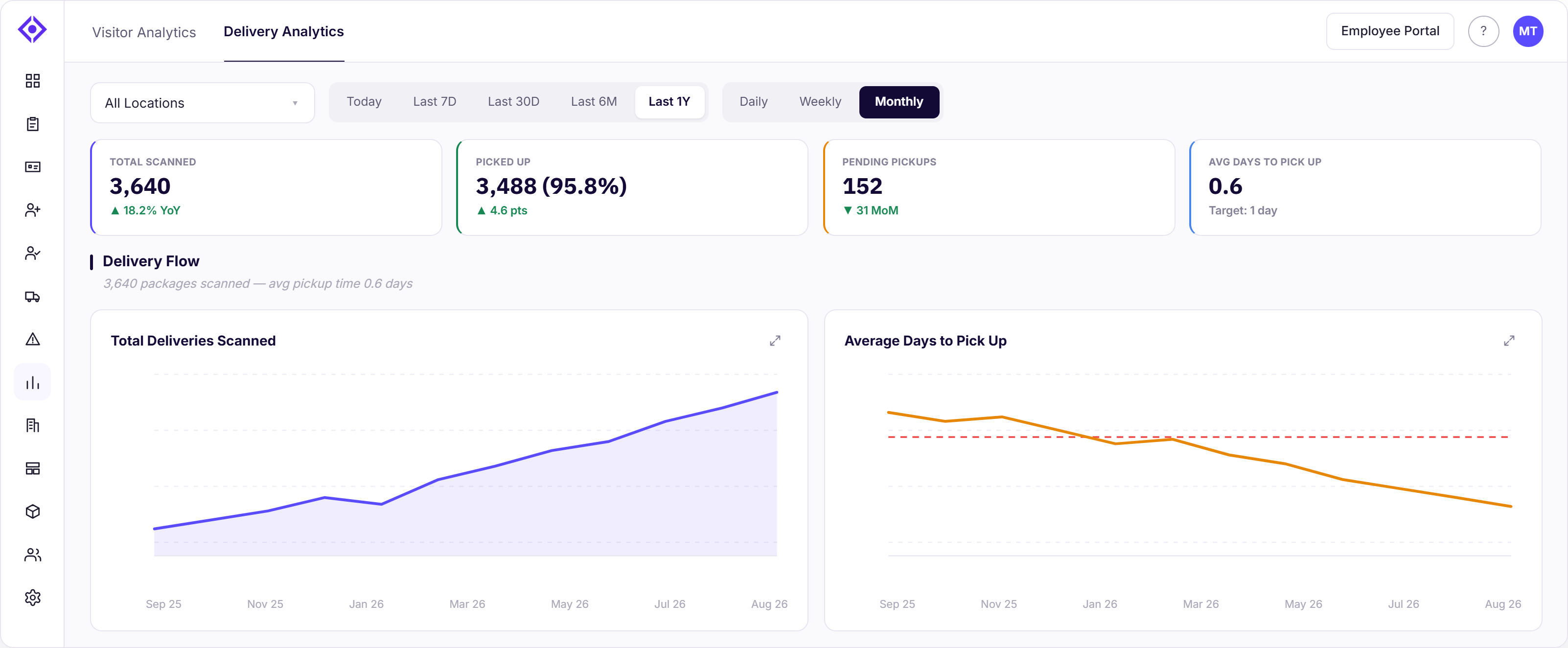
As with the rest of the New Admin Experience, this is a redesign of how you view and navigate your data — the underlying analytics capabilities are unchanged.
Platform
Easier navigation, better performance
The redesigned side panel puts Locations, Users, Integration Hub, and Settings within immediate reach — tidier, quicker, and noticeably faster to move through. Every second you save inside a dashboard shouldn't be lost hunting for the right screen to open it from, or waiting on it to load.
Switch on your schedule — with a deadline in view
Moving your whole team to a new interface overnight rarely goes smoothly, and we didn't want the value of this redesign to come at the cost of disrupting your operations. That's why the New Admin Experience ships as a toggle, not a takeover — switch between Classic and New with a single click, try it at one location first, and roll it out to your broader team on your own timeline.
That said, this isn't an indefinite option. Classic UI retires on September 2, 2026. You'll see a reminder banner in Classic between now and then, with a one-click "Switch to New" action right in it. We'd rather you move over deliberately — testing it, getting your team comfortable, working through any questions — than get switched over automatically on the retirement date itself.
Built for every kind of admin
The New Admin Experience isn't built around one job title — it's built around the different ways people actually manage a site. A Global Admin gets the full multi-location picture without clicking into each site. A Location Admin gets a clear, complete view of everything happening at their site. A Front Desk Admin gets a faster way to run visitor check-in all day, every day. An Evacuation Admin gets a workflow built for the moment minutes count. And a Deliveries Admin gets a mailroom view that surfaces problems before they become complaints. Whichever seat you sit in, the redesign is built for exactly that job — a faster, clearer way to see what matters and act on it, without forcing a hard cutover before your team is ready.
Try it today
The New Admin Experience is available now. Log in to your Visitly platform and select Switch to New in the banner at the top of Classic, or find the toggle in your account menu — you can switch back to Classic anytime before September 2, 2026.
Have feedback on the new dashboards? We'd love to hear it — reach out to our support team anytime.
FAQs
What is the new admin experience in Visitly?
It is a redesign of the admin side of the platform. The Visitor, Delivery, Multi-Location and Analytics dashboards, the Visitor Log, Pre-Registration and Emergency Management have a new layout, with a navigation panel that reaches Locations, Users, Integration Hub and Settings in fewer clicks. The older interface is called Classic.
Does the redesign change our data, permissions or integrations?
No. Data, permissions, integrations and workflows are identical. The change is to how admins see and reach them. The iPad kiosk check-in that visitors use is unchanged, and SSO, user roles and the API are untouched, so nothing built on an identity provider or the API needs rework.
Can we still use the Classic interface?
The announcement set September 2, 2026 as the retirement date for Classic, after which the new admin experience is the only option. Before that date admins could switch between the two with one click, location by location. If your account still shows Classic or you have questions about the change, contact the support team.
How much work is it to move a team to the new admin experience?
Very little. There is no data migration and nothing to reconfigure, because the underlying capabilities are the same. The work is showing each admin role where its daily actions now sit: check-in from the Upcoming tab, search and filters in the Visitor Log, and the grouped Analytics reports. Plan a short walkthrough per role.
What changed in Emergency Management?
Every location now appears as its own card showing total visitors and employees and how many are still on site, so the unaccounted number is visible without arithmetic. Admins can start an evacuation, send an alert from a template or open the live roster from the card. What an evacuation does has not changed.
What does the Multi-Location Dashboard show?
It shows expected and checked-in visitors for every site in the account on one screen. A security or facilities lead responsible for many locations can spot the site with unusual volume without opening each one. The data existed in Classic. The new view puts it in one place.